Python is a very flexible programming language which I use for data analysis, visualizations, and simulations. It's a high level language which allows for a steep learning curve and fast solutions. Moreover, python is open-source and therefore freely available for everybody. This is a list of python functions and short scripts which I use often. Note that they require the following pyton packages to be installed : matplotlib, scipy, numpy and brian (http://www.briansimulator.org/). Pick 100 random numbers with a gaussian distribution Fit a polynomial to data Fit an arbitrary function to data Two different y axes Eliminate axis tick marks Sophisticated figure layout 'ready to publish' Multi-panel figure with adjusted layout Multi-panel figure with varying cell sizes Arrange plots (.svg files) into composite figure Multi-panel figure with all plotting know-how Numerically integrate ODEs Next header
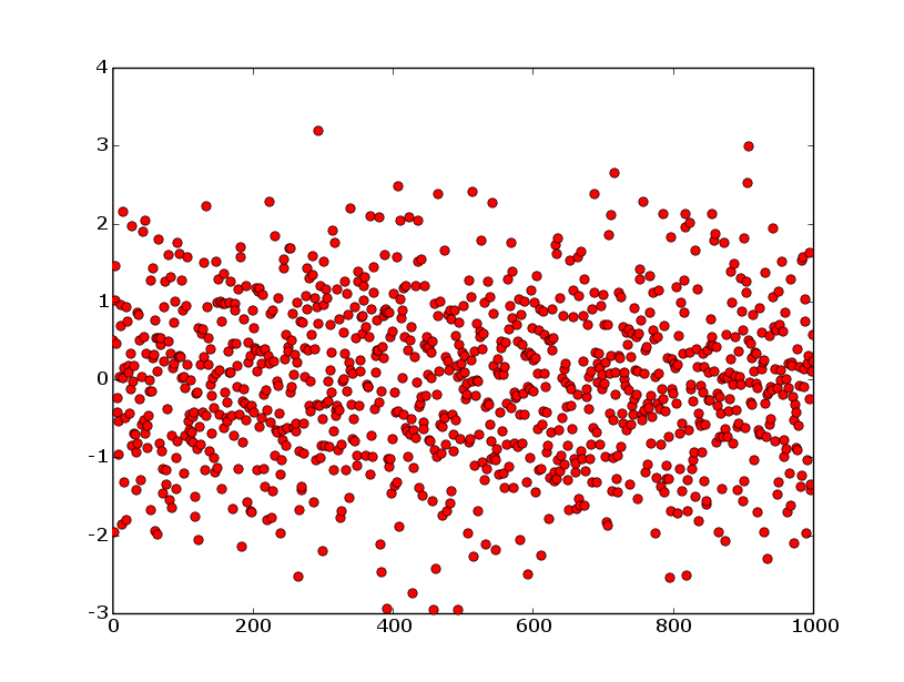
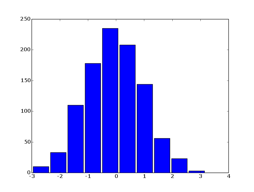
Pick 100 random numbers with a gaussian distribution nums = scipy.randn(100) #Plot the data and a histogram of the data with 10 bins pylab.plot(nums, 'ro') pylab.savefig('randnplot.png') pylab.cla() # clear the axes pylab.hist(nums, 10) pylab.savefig('randnhist.png')
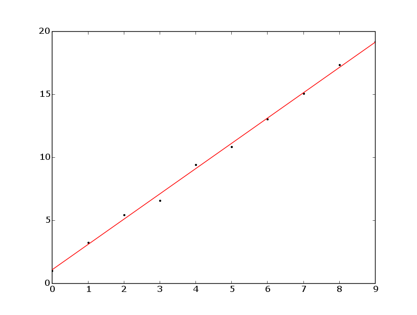
Fit a polynomial to data xdata = scipy.linspace(0, 9, num=10) ydata = 0.5+xdata*2.0 ydata += scipy.rand(10) polycoeffs = scipy.polyfit(xdata, ydata, 1) print polycoeffs # [ 2.00710807, 1.09204496] yfit = scipy.polyval(polycoeffs, xdata) pylab.plot(xdata, ydata, 'k.') pylab.plot(xdata, yfit, 'r-')
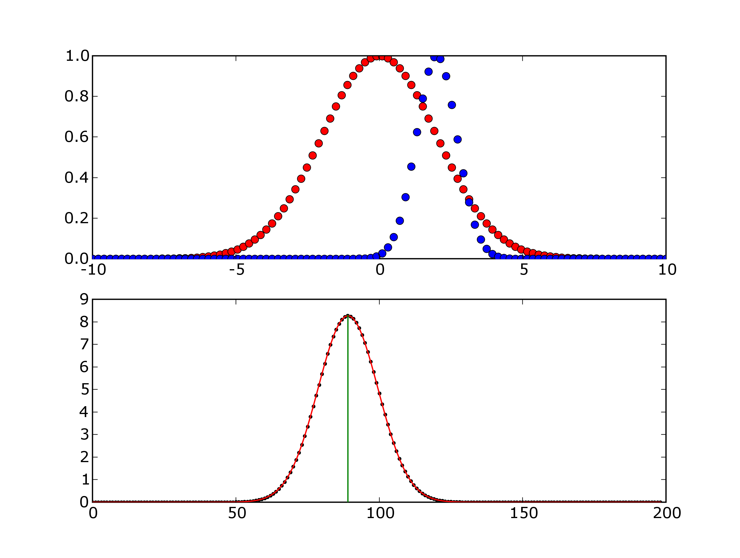
Fit an arbitrary function to data import scipy, pylab import scipy.optimize # make x data num = 100 x = scipy.linspace(-10, 10, num=num) distancePerLag = x[1]-x[0] # make two gaussians, with different means offset = 2.0 y1 = scipy.exp(-x**2/8.0) y2 = scipy.exp(-(x-offset)**2/1.0) # compute the cross-correlation between y1 and y2 ycorr = scipy.correlate(y1, y2, mode='full') xcorr = scipy.linspace(0, len(ycorr)-1, num=len(ycorr)) # define a gaussian fitting function where # p[0] = amplitude # p[1] = mean # p[2] = sigma fitfunc = lambda p, x: p[0]*scipy.exp(-(x-p[1])**2/(2.0*p[2]**2)) errfunc = lambda p, x, y: fitfunc(p,x)-y # guess some fit parameters p0 = scipy.c_[max(ycorr), scipy.where(ycorr==max(ycorr))[0], 5] # fit a gaussian to the correlation function p1, success = scipy.optimize.leastsq(errfunc, p0.copy()[0], args=(xcorr,ycorr)) # compute the best fit function from the best fit parameters corrfit = fitfunc(p1, xcorr) # get the mean of the cross-correlation xcorrMean = p1[1] # convert index to lag steps # the first point has index=0 but the largest (negative) lag # there is a simple mapping between index and lag nLags = xcorrMean-(len(y1)-1) # convert nLags to a physical quantity # note the minus sign to ensure that the # offset is positive for y2 is shifted to the right of y1 # a negative offset means that y2 is shifted to the left of y1 # I don't know what the standard notation is (if there is one) offsetComputed = -nLags*distancePerLag # see how well you have done by comparing the actual # to the computed offset print 'xcorrMean, nLags = ', \ xcorrMean, ', ', nLags print 'actualOffset, computedOffset = ', offset,', ', offsetComputed # visualize the data # plot the initial functions pylab.subplot(211) pylab.plot(x, y1, 'ro') pylab.plot(x, y2, 'bo') # plot the correlation and fit to the correlation pylab.subplot(212) pylab.plot(xcorr, ycorr, 'k.') pylab.plot(xcorr, corrfit, 'r-') pylab.plot([xcorrMean, xcorrMean], [0, max(ycorr)], 'g-') pylab.show()
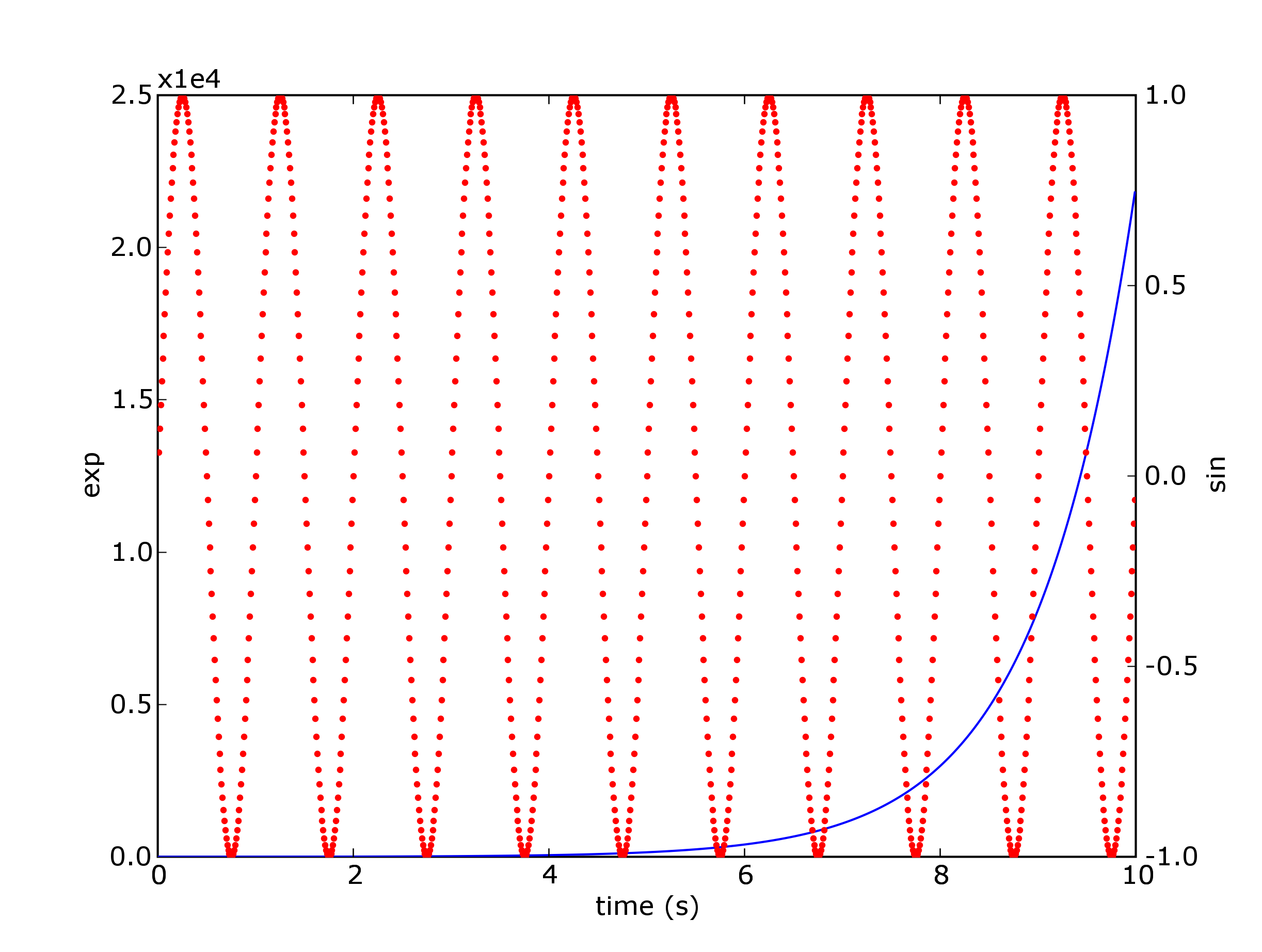
Two different y axes """ Demonstrate how to do two plots on the same axes with different left right scales. The trick is to use *2 different axes*. Turn the axes rectangular frame off on the 2nd axes to keep it from obscuring the first. Manually set the tick locs and labels as desired. You can use separate matplotlib.ticker formatters and locators as desired since the two axes are independent. This is acheived in the following example by calling pylab's twinx() function, which performs this work. See the source of twinx() in pylab.py for an example of how to do it for different x scales. (Hint: use the xaxis instance and call tick_bottom and tick_top in place of tick_left and tick_right.) """ from pylab import * ax1 = subplot(111) t = arange(0.01, 10.0, 0.01) s1 = exp(t) plot(t, s1, 'b-') xlabel('time (s)') ylabel('exp') # turn off the 2nd axes rectangle with frameon kwarg ax2 = twinx() s2 = sin(2*pi*t) plot(t, s2, 'r.') ylabel('sin') ax2.yaxis.tick_right() show()
Eliminate Tick Marks from Plots import pylab # first axes y = pylab.arange(10) ax1=pylab.subplot(211) pylab.plot(y) ax1.xaxis.set_major_locator(pylab.NullLocator()) pylab.title('This x-axis has no ticks') # second axes ax2=pylab.subplot(212) pylab.plot(y) pylab.title('This x-axis has ticks')

Sophisticated figure layout 'ready to publish' from matplotlib import rcParams import numpy as np import matplotlib.pyplot as plt #set plot attributes fig_width = 7 # width in inches fig_height = 4.2 # height in inches fig_size = [fig_width,fig_height] params = {'axes.labelsize': 14, 'axes.titlesize': 14, 'font.size': 10, 'xtick.labelsize': 12, 'ytick.labelsize': 12, 'figure.figsize': fig_size, 'savefig.dpi' : 600, 'axes.linewidth' : 1.3, 'ytick.major.size' : 6, # major tick size in points 'xtick.major.size' : 6 # major tick size in points #'xtick.major.size' : 2, #'ytick.major.size' : 2, } rcParams.update(params) # set sans-serif font to Arial rcParams['font.sans-serif'] = 'Arial' def sigmoid(x): return 1./(1+np.exp(-(x-5)))+1 # data to be displayed np.random.seed(1234) t = np.arange(0.1, 9.2, 0.15) y = sigmoid(t) + 0.2*np.random.randn(len(t)) residuals = y - sigmoid(t) t_fitted = np.linspace(0, 10, 100) ########################### #adjust plots position ########################### fig = plt.figure() ax1 = plt.axes((0.14, 0.12, 0.65, 0.8)) plt.plot(t, y, 'b.', ms=5., clip_on=False) plt.plot(t_fitted, sigmoid(t_fitted), 'r-', lw=3) plt.text(5, 1.0, r"$L = \frac{1}{1+\exp(-V+5)}+10$", fontsize=14, transform=ax1.transData, clip_on=False, va='top', ha='left') #set axis limits ax1.set_xlim((0, t.max())) ax1.set_ylim((0.5, y.max())) #hide right and top axes ax1.spines['top'].set_visible(False) ax1.spines['right'].set_visible(False) ax1.spines['bottom'].set_position(('outward', 10)) ax1.spines['left'].set_position(('outward', 10)) ax1.yaxis.set_ticks_position('left') ax1.xaxis.set_ticks_position('bottom') #set labels plt.xlabel(r'voltage (V, $\mu$V)') plt.ylabel('luminescence (L)') #make inset ax_inset = plt.axes((0.25, 0.74, 0.2, 0.2), frameon=False) plt.hist(residuals, fc='0.8',ec='w', lw=2) plt.xticks([-0.5, 0, 0.5],[-0.5, 0, 0.5], size=6) plt.xlim((-0.5, 0.5)) plt.yticks([5, 10], size=6) plt.xlabel("residuals", size=8) ax_inset.xaxis.set_ticks_position("none") ax_inset.yaxis.set_ticks_position("left") # change ticks for inset for line in ax_inset.get_yticklines(): line.set_markersize(4) line.set_markeredgewidth(0.5) ax_inset.yaxis.grid(lw=1, color='w', ls='-') plt.text(0, 0.9, "frequency", transform=ax_inset.transAxes, va='center', ha='right', size=8) #export to svg and png plt.savefig('sigmoid_fit.png') plt.savefig('sigmoid_fit.svg')

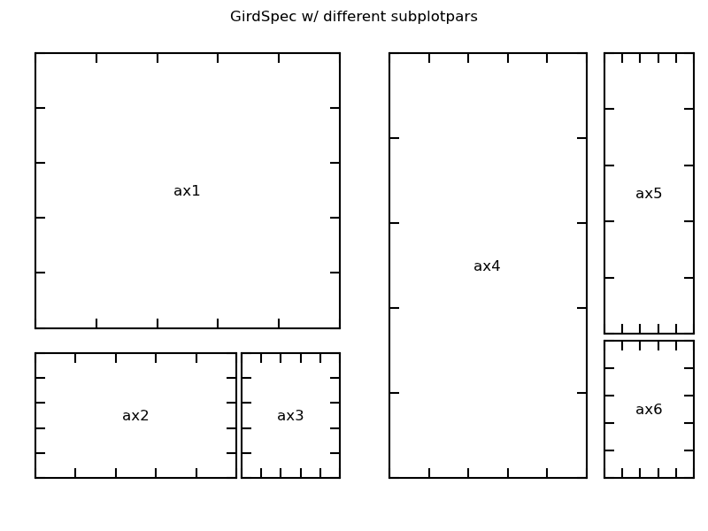
Multi-panel figure with adjusted layout """ A gridspec instance provides array-like (2d or 1d) indexing that returns the SubplotSpec instance. For, SubplotSpec that spans multiple cells, use slice. When a GridSpec is explicitly used, you can adjust the layout parameters of subplots that are created from the gridspec. This is similar to subplots_adjust, but it only affects the subplots that are created from the given GridSpec. """ import matplotlib.pyplot as plt from matplotlib.gridspec import GridSpec def make_ticklabels_invisible(fig): for i, ax in enumerate(fig.axes): ax.text(0.5, 0.5, "ax%d" % (i+1), va="center", ha="center") for tl in ax.get_xticklabels() + ax.get_yticklabels(): tl.set_visible(False) # demo 3 : gridspec with subplotpars set. f = plt.figure() plt.suptitle("GirdSpec w/ different subplotpars") gs1 = GridSpec(3, 3) # right spacing creates space for gs2 gs1.update(left=0.05, right=0.48, wspace=0.05) ax1 = plt.subplot(gs1[:-1, :]) ax2 = plt.subplot(gs1[-1, :-1]) ax3 = plt.subplot(gs1[-1, -1]) gs2 = GridSpec(3, 3) # left spacing creates space for gs1 gs2.update(left=0.55, right=0.98, hspace=0.05) ax4 = plt.subplot(gs2[:, :-1]) ax5 = plt.subplot(gs2[:-1, -1]) ax6 = plt.subplot(gs2[-1, -1]) make_ticklabels_invisible(plt.gcf()) #plt.show() #export to svg and png plt.savefig('gridspec.png') plt.savefig('gridspec.svg')
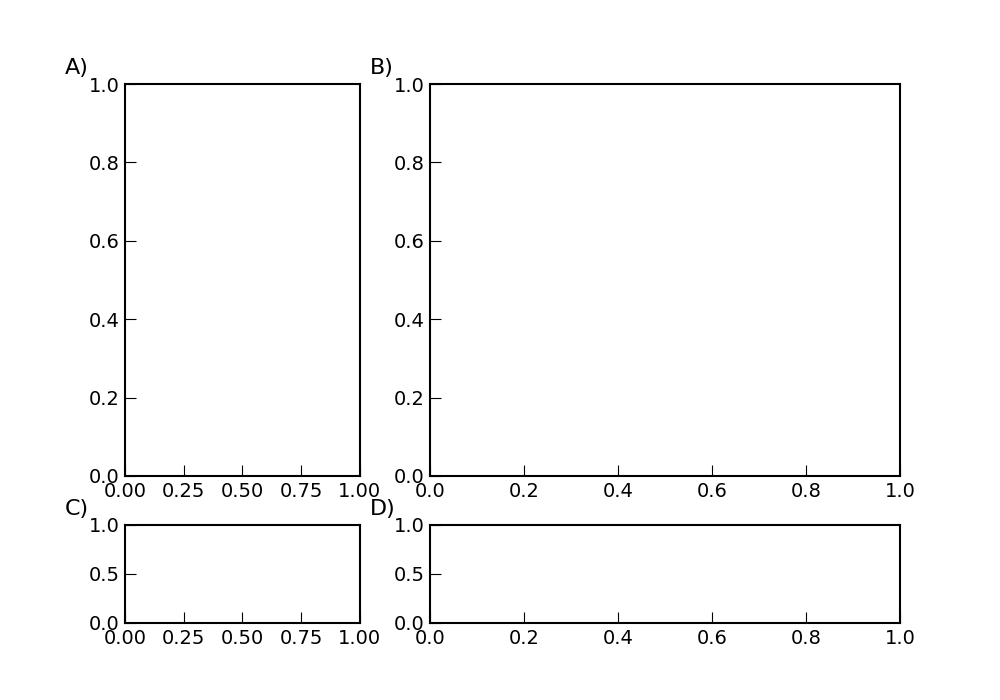
Multi-panel figure with varying cell sizes and automatic labeling """ By default, GridSpec creates cells of equal sizes. You can adjust relative heights and widths of rows and columns. Note that absolute values are meaningless, only their relative ratios matter. The labelling code is taken from Dan Goodman. More infos on GridSpec can be found here. """ import matplotlib.pyplot as plt import matplotlib.gridspec as gridspec def make_ticklabels_invisible(fig): for i, ax in enumerate(fig.axes): ax.text(0.5, 0.5, "ax%d" % (i+1), va="center", ha="center") for tl in ax.get_xticklabels() + ax.get_yticklabels(): tl.set_visible(False) def label_panel(ax, letter, *,offset_left=0.6, offset_up=0.1, prefix='', postfix=')', **font_kwds): kwds = dict(fontsize=16) kwds.update(font_kwds) # this mad looking bit of code says that we should put the code offset a certain distance in # inches (using the fig.dpi_scale_trans transformation) from the top left of the frame # (which is (0, 1) in ax.transAxes transformation space) fig = ax.figure trans = ax.transAxes + transforms.ScaledTranslation(-offset_left, offset_up, fig.dpi_scale_trans) ax.text(0, 1, prefix+letter+postfix, transform=trans, **kwds) def label_panels(axes, letters=None, **kwds): if letters is None: letters = axes.keys() for letter in letters: ax = axes[letter] label_panel(ax, letter, **kwds) f = plt.figure() gs = gridspec.GridSpec(2, 2, width_ratios=[1,2], height_ratios=[4,1] ) ax1 = plt.subplot(gs[0]) ax2 = plt.subplot(gs[1]) ax3 = plt.subplot(gs[2]) ax4 = plt.subplot(gs[3]) make_ticklabels_invisible(f) #plt.show() label_panel(ax1,'A') label_panel(ax2,'B') label_panel(ax3,'C') label_panel(ax4,'D') plt.savefig('gridspec3.png') plt.savefig('gridspec3.svg')
Arrange plots (.svg files) into composite figure """ The procedure uses the small Python package svgutils. It is written completely in Python and uses only standard libraries. You may download it from github. More infos can be found here. """ import svgutils.transform as sg import sys #create new SVG figure fig = sg.SVGFigure("20.5cm", "6.5cm") # load matpotlib-generated figures fig1 = sg.fromfile('sigmoid_fit.svg') fig2 = sg.fromfile('anscombe.svg') # get the plot objects plot1 = fig1.getroot() plot2 = fig2.getroot() plot2.moveto(370, 0, scale=0.65) # add text labels txt1 = sg.TextElement(25,20, "A", size=12, weight="bold") txt2 = sg.TextElement(420,20, "B", size=12, weight="bold") # append plots and labels to figure fig.append([plot1, plot2]) fig.append([txt1, txt2]) # save generated SVG and PNG files fig.save("fig_final.svg") fig.save("fig_final.png")

Multi-panel figure with all plotting know-how """ All the know-how I have accumulated over time to generate multi-panel figures with various layout changes. """ from scipy import * from numpy import * from numpy.fft import * from math import * from pylab import * import scipy.signal import scipy.stats import os import pdb import random import sys import time import pickle from matplotlib import rcParams import numpy as np import matplotlib.pyplot as plt import matplotlib.gridspec as gridspec # data to plot x = arange(-10,10,0.1) siny = sin(x) cosy = cos(x) # set plot attributes fig_width = 12 # width in inches fig_height = 8 # height in inches fig_size = [fig_width,fig_height] params = {'axes.labelsize': 14, 'axes.titlesize': 13, 'font.size': 11, 'xtick.labelsize': 11, 'ytick.labelsize': 11, 'figure.figsize': fig_size, 'savefig.dpi' : 600, 'axes.linewidth' : 1.3, 'ytick.major.size' : 4, # major tick size in points 'xtick.major.size' : 4 # major tick size in points #'edgecolor' : None #'xtick.major.size' : 2, #'ytick.major.size' : 2, } rcParams.update(params) # set sans-serif font to Arial rcParams['font.sans-serif'] = 'Arial' # create figure instance fig = plt.figure() # define sub-panel grid and possibly width and height ratios gs = gridspec.GridSpec(2, 2, width_ratios=[1,1.2], height_ratios=[1,1] ) # define vertical and horizontal spacing between panels gs.update(wspace=0.3,hspace=0.4) # possibly change outer margins of the figure #plt.subplots_adjust(left=0.14, right=0.92, top=0.92, bottom=0.18) # sub-panel enumerations plt.figtext(0.06, 0.92, 'A',clip_on=False,color='black', weight='bold',size=22) plt.figtext(0.47, 0.92, 'B',clip_on=False,color='black', weight='bold',size=22) plt.figtext(0.06, 0.47, 'C',clip_on=False,color='black', weight='bold',size=22) plt.figtext(0.47, 0.47, 'D',clip_on=False,color='black', weight='bold',size=22) # first sub-plot ####################################################### ax0 = plt.subplot(gs[0]) # title ax0.set_title('sub-plot 1') # diplay of data ax0.axhline(y=0,ls='--',color='0.5',lw=2) ax0.axvline(x=0,ls='--',color='0.5',lw=2) ax0.plot(x,siny,label='sin') ax0.plot(x,cosy,label='cos') # removes upper and right axes # and moves left and bottom axes away ax0.spines['top'].set_visible(False) ax0.spines['right'].set_visible(False) ax0.spines['bottom'].set_position(('outward', 10)) ax0.spines['left'].set_position(('outward', 10)) ax0.yaxis.set_ticks_position('left') ax0.xaxis.set_ticks_position('bottom') # legends and labels plt.legend(loc=1,frameon=False) plt.xlabel('time (sec)') plt.ylabel('oscillations') # second sub-plot ####################################################### # creates sub-panels in second sub-plot gssub = gridspec.GridSpecFromSubplotSpec(2, 2, subplot_spec=gs[1],hspace=0.4) # sub-panel 1 ############################################# ax10 = plt.subplot(gssub[0]) # diplay of data ax10.axhline(y=0,ls='--',color='0.5',lw=2) ax10.axvline(x=0,ls='--',color='0.5',lw=2) ax10.plot(x,siny,label='sin') # removes upper, lower and right axes # and moves left axis away ax10.spines['top'].set_visible(False) ax10.spines['right'].set_visible(False) ax10.spines['bottom'].set_visible(False) ax10.spines['left'].set_position(('outward', 10)) ax10.yaxis.set_ticks_position('left') ax10.axes.get_xaxis().set_visible(False) # sub-panel 2 ############################################# ax11 = plt.subplot(gssub[1]) # diplay of data ax11.axhline(y=0,ls='--',color='0.5',lw=2) ax11.axvline(x=0,ls='--',color='0.5',lw=2) ax11.plot(x,cosy,label='sin') # removes all axes ax11.spines['top'].set_visible(False) ax11.spines['right'].set_visible(False) ax11.spines['bottom'].set_visible(False) ax11.spines['left'].set_visible(False) ax11.axes.get_xaxis().set_visible(False) ax11.axes.get_yaxis().set_visible(False) text11 = ax11.annotate(r'$y = cos(x)$', xy=(1,1.1), annotation_clip=False, xytext=None, textcoords='data',fontsize=15, arrowprops=None ) # sub-panel 3 ############################################# ax12 = plt.subplot(gssub[2]) # diplay of data ax12.axhline(y=0,ls='--',color='0.5',lw=2) ax12.axvline(x=0,ls='--',color='0.5',lw=2) ax12.plot(x,cosy,label='sin') # removes upper and right axes # and moves left and bottom axes away ax12.spines['top'].set_visible(False) ax12.spines['right'].set_visible(False) ax12.spines['bottom'].set_position(('outward', 10)) ax12.spines['left'].set_position(('outward', 10)) ax12.yaxis.set_ticks_position('left') ax12.xaxis.set_ticks_position('bottom') plt.xlabel('time (sec)',position=(1.1,-0.2)) plt.ylabel('oscillations',position=(-0.2,1.1)) # sub-panel 4 ############################################# ax13 = plt.subplot(gssub[3]) # diplay of data ax13.axhline(y=0,ls='--',color='0.5',lw=2) ax13.axvline(x=0,ls='--',color='0.5',lw=2) ax13.plot(x,siny,label='sin') # removes upper, left and right axes # and moves bottom axis away ax13.spines['top'].set_visible(False) ax13.spines['right'].set_visible(False) ax13.spines['left'].set_visible(False) ax13.spines['bottom'].set_position(('outward', 10)) ax13.xaxis.set_ticks_position('bottom') ax13.axes.get_yaxis().set_visible(False) # third sub-plot ####################################################### ax2 = plt.subplot(gs[2]) # diplay of data ax2.axhline(y=0,ls='--',color='0.5',lw=2) ax2.axvline(x=0,ls='--',color='0.5',lw=2) ax2.plot(x,siny,label='sin') ax2.plot(x,cosy,label='cos') # removes upper and right axes # and moves left and bottom axes away ax2.spines['top'].set_visible(False) ax2.spines['right'].set_visible(False) ax2.spines['bottom'].set_position(('outward', 10)) ax2.spines['left'].set_position(('outward', 10)) ax2.yaxis.set_ticks_position('left') ax2.xaxis.set_ticks_position('bottom') # legends and labels plt.legend(loc=3,frameon=False) plt.xlabel('time (sec)') plt.ylabel('oscillations') # change tick spacing majorLocator_x = MultipleLocator(10) ax2.xaxis.set_major_locator(majorLocator_x) bracket = ax2.annotate('', xy=(-4.8, 0.98), xycoords='data', annotation_clip=False, xytext=(0, 0.98), textcoords='data', arrowprops=dict(arrowstyle="-", connectionstyle='bar,fraction=0.22', linewidth=2, ec='k', shrinkA=10, shrinkB=10, ) ) text = ax2.annotate(r'$\ast\ast$', xy=(-3.2,1.16), annotation_clip=False, xytext=None, textcoords='data',fontsize=15, arrowprops=None ) # fourth sub-plot ####################################################### ax3 = plt.subplot(gs[3]) # diplay of data ax3.axhline(y=0,ls='--',color='0.5',lw=2) ax3.axvline(x=0,ls='--',color='0.5',lw=2) ax3.plot(x,siny,label='sin') ax3.plot(x,cosy,label='cos') # removes upper and right axes # and moves left and bottom axes away ax3.spines['top'].set_visible(False) ax3.spines['right'].set_visible(False) ax3.spines['bottom'].set_position(('outward', 10)) ax3.spines['left'].set_position(('outward', 10)) ax3.yaxis.set_ticks_position('left') ax3.xaxis.set_ticks_position('bottom') # legends and labels plt.xlabel('time (sec)') plt.ylabel('oscillations') # add arrows (or lines) to plot ax3.annotate('', xy=(-7.5, 0.6), xytext=(-9, 0.6), annotation_clip=False, arrowprops=dict(arrowstyle="->",facecolor='black',lw=2), ) ax3.annotate('', xy=(-4, -0.7), xytext=(-5.5, -0.7), annotation_clip=False, arrowprops=dict(arrowstyle="->",facecolor='black',lw=2), ) # legend position defined by coordinates plt.legend(loc=(0.2,0.5),frameon=False) # change legend text size leg = plt.gca().get_legend() ltext = leg.get_texts() plt.setp(ltext, fontsize=11) ## save figure ############################################################ fname = 'fig_example_plot' savefig(fname+'.png') savefig(fname+'.pdf')

Numerically integrate ODEs """ Use 'odeint' to ingreate odinary differential equations. """ from scipy.integrate import odeint from pylab import * # for plotting commands def deriv0(y,t): # right hand side of equation (2) taur = 10. taud = 30. Cpre = 1. npre = Cpre*(1./taud - 1./taur)*( (taur/taud)**(1./(1.-taur/taud)) - (taur/taud)**(1./(taud/taur-1.)) )**(-1.) return array([-y[0]/taur + y[1]*npre,-y[1]/taud]) once = True time0 = linspace(0.0,20.,2001) yinit0 = array([0.0,1.]) # initial value y0 = odeint(deriv0,yinit0,time0[:-1]) def deriv1(y,t): taur = 10. taud = 30. Cpre = 1. npre = Cpre*(1./taud - 1./taur)*( (taur/taud)**(1./(1.-taur/taud)) - (taur/taud)**(1./(taud/taur-1.)) )**(-1.) # taurp = 2. taudp = 12. Cpost = 2.5 npost = Cpost*(1./taudp - 1./taurp)*( (taurp/taudp)**(1./(1.-taurp/taudp)) - (taurp/taudp)**(1./(taudp/taurp-1.)) )**(-1.) # return array([-y[0]/taur + y[1]*npre,-y[1]/taud,-y[2]/taurp + y[3]*npost,-y[3]/taudp]) eta = 1.5 time1 = linspace(20.,100.,8001) yinit1 = array([y0[-1,0],y0[-1,1],0.0,1.+eta*y0[-1,0]]) y1 = odeint(deriv1,yinit1,time1) time = hstack((time0[:-1],time1)) y = vstack((y0,y1[:,:2])) ytot = copy(y[:,0]) ytot[-len(y1[:,2]):] += y1[:,2] figure() plot(time,y[:,0],label='A') plot(time,y[:,1],label='B') plot(time1,y1[:,2],label='E') plot(time1,y1[:,3],label='F') plot(time,ytot,c='k',lw=2,label='A+E') xlabel('time (ms)') ylabel('calcium') legend(frameon=False) fname = 'odeint_example' savefig(fname+'.png') savefig(fname+'.pdf')
